search

This global healthcare company was struggling to manage the vast number of applications their scientists used in their critical research. Despite efforts to improve accessibility, applications remained difficult to find and false starts brought about skepticism and a lack of trust.

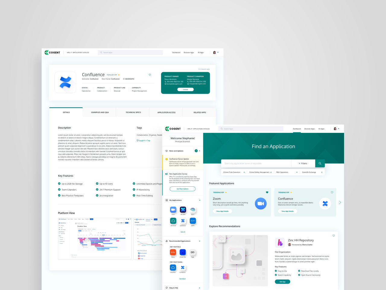
To bring about change users could be excited by, Veracity created an experience built to surface mountains of applications into a single searchable location. Influenced by user journeys and discovery workshops, our catalog design strategically targeted the explicit concerns of users and IT managers alike, prioritizing their people, intentionally coordinating chaos and delivering an improved overall experience; so, scientists could focus on critical research rather than application overload.

Veracity designed a transformative, exploratory product catalog, integrating 6k+ applications to inspire scientific research.

Prioritizing People, Perceptions and Attitudes

Through discovery workshops, Veracity mapped the employee experience journey and identified four personas that needed application information support. Additional empathy maps for all personas provided insight for a prioritized list of features and planted a seed of excitement and anticipation in an audience weary of false starts.

Coordinating Chaos

With 6000+ applications company wide, reducing the number of competing repositories and implementing a robust search mechanism was essential to making it easy for scientists to find the right information at the right time. Veracity defined an organizational taxonomy, content examples and a taxonomy playbook to document best practices and standards moving forward.

From Native Knowledge to Exploratory Product Catalog

Although our client worked hard to provide their research teams with boundless applications and tools (6k+ applications), researchers had no easy way to find them. Veracity leveraged insights from discovery workshops and persona development to reimagine product delivery and transform a less-than-thrilling product catalog concept to a tailored, exploratory experience. Through a taxonomy of relevant categories, multidimensional filters and hyper-personalized recommendation features, researchers could now effortlessly (and addictively) browse and explore essential applications to empower research capabilities and innovation through one source of truth—eliminating the need to track down information through an unreliable game of telephone.

Designing for Change

Veracity conducted 13 usability sessions with research scientists and managers to gather feedback on behavior and attitude across four design variations. The result? A modern UI and prototype that focused users on the task of finding specific applications and discovering new applications.