search

As this global food packing company began shifting toward an increasingly remote workforce, they found their IT service delivery platform wasn’t able to keep up with demand. Users had difficulty navigating through overly complex taxonomy and unintuitive naming conventions made things hard to find. And because more people were regularly working from home, the need to easily submit IT requests and track completion progress became paramount. Users were overwhelmed—and so was the IT department.

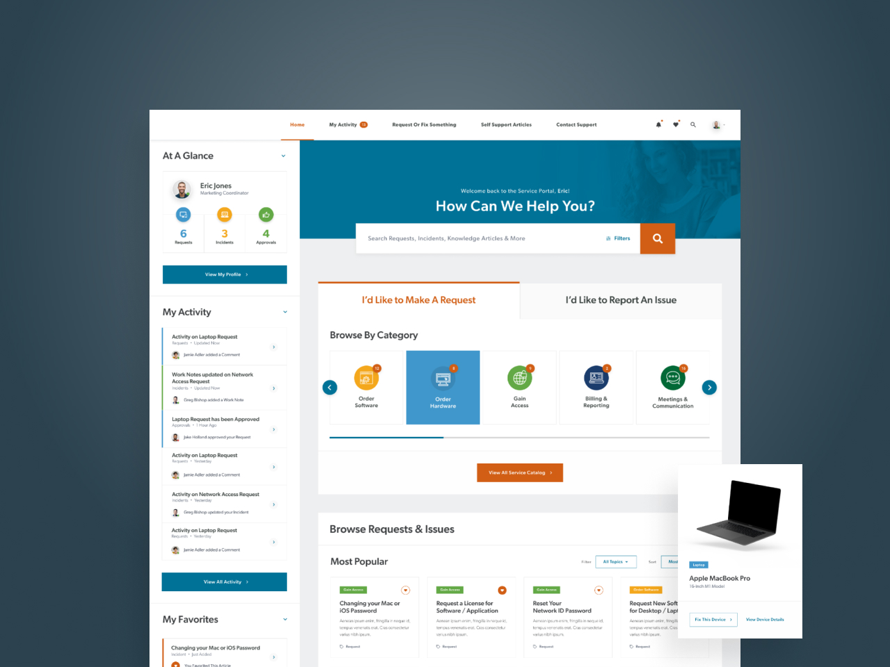
To empower users to resolve common needs, Veracity focused on harnessing the power of ServiceNow to deliver an engaging, user-friendly interface designed to let employees self-serve first. By providing intuitive access to support resources and surfacing the visibility of notifications through a reimagined dashboard, we created a streamlined and efficient process, reduced inbox overload and provided an avenue for independence.

We harnessed the power of ServiceNow to reimagine the self-service support portal, empowering 50k+ employees through personalized, data-driven dashboards.

Goodbye to Email Clutter

Focus groups and participatory design sessions revealed that employees were frustrated by the lack of visibility related to support tickets. Users could only track them one way—through automated email notifications. So, when inboxes were overrun with irrelevant notifications, users gave up and hit delete. Veracity reimagined our client’s platform to create an intuitive, user-friendly interface. By streamlining request forms and introducing notifications, requests, approvals and other activity front and center, users were able to easily submit support tickets and view their status at a glance, saving time, frustration and eliminating the need for the automated email notifications that were cluttering their inboxes.

Revamping Taxonomy for Increased Satisfaction

Through interviews with a diverse group of stakeholders and users, we found people were having trouble finding things. The IT service delivery portal was suffering from overly complex organization, jargon-laden taxonomy categories and a lack of findability. Insights gathered from discovery sessions and user testing methodologies including card sorts and tree jack testing, informed a simplified taxonomy. By renaming categories in plain-speak, we made it easier for users to effectively find what they were looking for resulting in higher user satisfaction and a massive reduction in support tickets.

Empowering Self-Service Through Simplicity

To strike the right balance of information and interactivity, Veracity took a dashboard approach, streamlining the design to encourage users to explore and navigate the experience, while highlighting more prominent actions and activity within the portal. Reimagined taxonomy in combination with prominent favorites and frequently visited requests provided intuitive access to relevant support resources, giving users the option to self-serve first. Live support options are still one click away, following them through the entire experience.

Project Outcomes

+50
Employees Benefiting from Personalized Experience
10
Custom Page Templates & 19 Custom Widgets Designed
500
Knowledge Base Articles Reorganized into 8 Core Categories