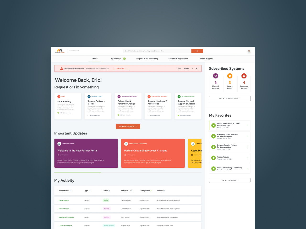
One of the largest banking institutions in the United States, this preeminent global financial services company provides asset servicing, investment management and wealth management for corporate institutions and individuals. But when their advisors were facing frustrations navigating a complex service catalog and losing tickets in unclear workflows, they couldn’t do what they do best—make money for their clients.
To tackle the design challenge, Veracity collaborated with users through extensive research and review sessions, identifying key pain points and frustrations. By placing the user at the start of their journey and prioritizing their needs, we were able to create a reliable, user-first experience that delivers not just improved functionality and efficiency, but greater engagement and adoption of the platform.
01.
Simplifying Taxonomy for Improved Employee Experience
Veracity identified an issue with their service catalog taxonomy, which was burdened with acronyms that made it difficult for users to navigate without deep organizational knowledge. To address this issue, Veracity utilized various UX-design methods such as card sorting and focus group interviews to streamline the taxonomy. As a result, we were able to significantly reduce the number of categories from 30k+ to a more manageable 57-topic taxonomy. This overhaul of the service catalog not only simplifies the user experience but also increases users’ ability to find what they are looking for.
02.
Breaking Free from One-Off Configurations
Veracity faced a challenge with their current customized platform, which resulted in rigid, one-off specialty configurations that made effectively targeting user groups difficult. Using insights uncovered by current state analyses, our team created a unified design system, reusable modular widgets and personalized dashboards to surface deeper, more meaningful information for users.
03.
Transparency & Trust Restored
Unfortunately, a lack of visibility into incidents, requests and approvals on their current platform resulted in frustration and distrust by users. To address this, Veracity streamlined process alerts, workflow and governance to provide transparency and faster ticket processing times. This effort has led to confident employees who can rely on an efficient platform. By increasing transparency, Veracity has addressed user concerns and increased user trust—leading to higher adoption and engagement.
key metrics
Project Outcomes
User Focus Groups To Understand Pain Points, Gaps & Opportunities
Design Comps Reimagining Dashboards, Search, Service Catalog & More
Reduced Catalog Item Taxonomy to 57 from 30k+ Using Conditional Logic
case studies


